


Seinäjoki City Orchestra was founded in 1936. As part of the visual identity renewal, the logomark was refined to be timeless and strongly connected to the visual language of instruments. Motion design and the “string” element play with the same motifs, revealing a more contemporary side to the identity.


Kääntöpuolii is Reino Nordins fourth album. The symbol represents the albums theme “flipsides” and explores forms of contrast. The symbol was used independently, as well paired with typography for music videos and the albums single covers. Concert photograph shot by Vilma Töyräs

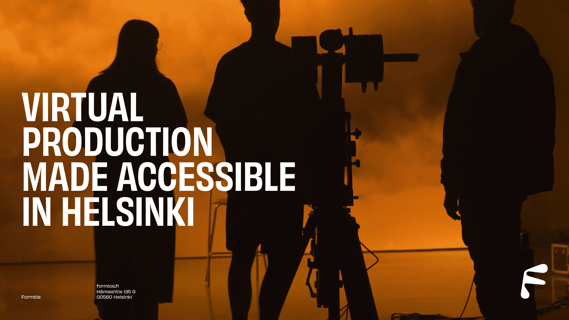
Formlös is a studio utilising camera tracking technologies for an accessible way to create unique and other ways time-consuming video and image productions. The logotype is based on the studios name and concept (formlös = formless), while the identity showcases a more straightforward industrial approach.